The most powerful luxury brands don’t simply have an aesthetic. They create a world.
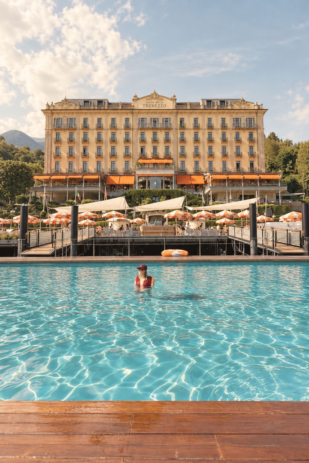
You recognize them before you see the logo. You feel them in the materials, the lighting, the scent, the weight of the menu, and even the color of the flowers on the table. Grand Hotel Tremezzo on Lake Como is an extraordinary example of this kind of branding. Its identity doesn’t live in one logo or one beautifully designed website. It is woven through the entire experience of being there. Every detail reinforces the same point of view, creating something much more powerful than visual consistency: a controlled sensory world.
And that is where luxury branding becomes immersive.
Luxury Branding Is a System, Not a Logo
Many brands—especially service businesses and entrepreneurs—begin by thinking about identity in purely visual terms.
What should our logo look like?
Which fonts should we use?
What colors belong on the website?
Those things matter. But the brands that feel truly premium go further. They build a recognizable language and then repeat that language across dozens of small interactions, both physical and digital.
At Grand Hotel Tremezzo, the brand becomes something you can see, touch, smell, and feel. The same principle applies whether you run a hotel or a catering company, an interior design studio, an event planning business, or a personal brand as a singer or creative. The goal is the same: create a world people recognize and want to return to.
Color Creates an Emotional Signature
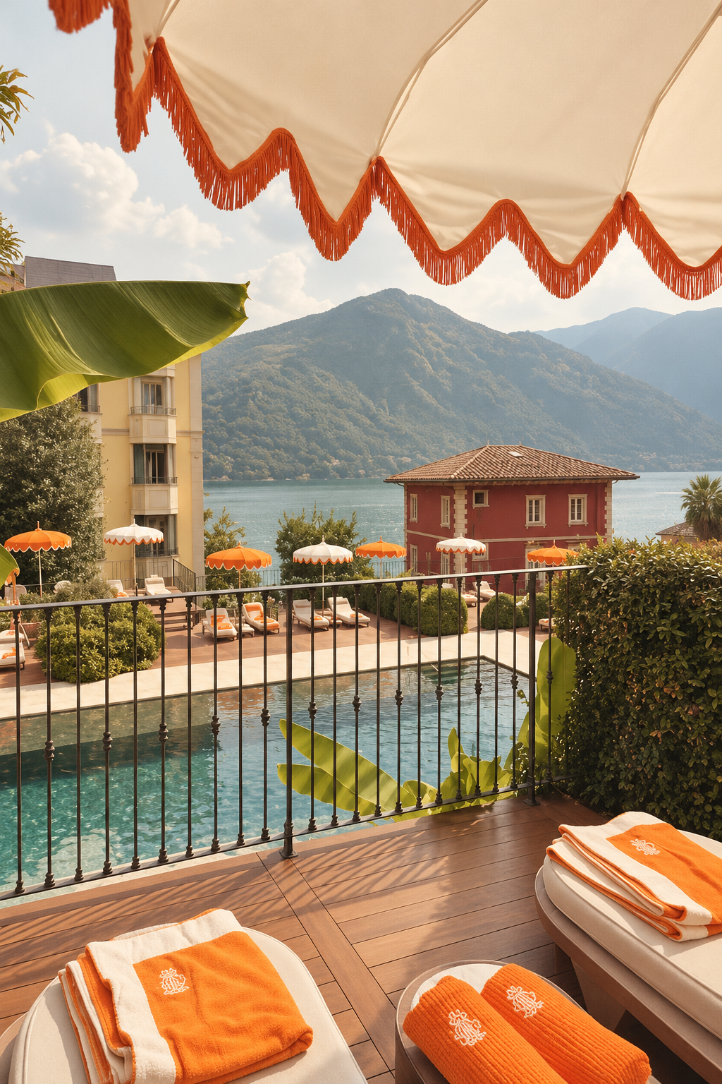
One of the hotel’s most recognizable choices is its use of orange.
Against the blues and greens of Lake Como, orange becomes an intentional contrast. It feels warm, energetic, and distinctly Mediterranean. It recalls Italian sunlight, citrus fruit, evening aperitivo, and the warmth of a summer afternoon.
The important lesson isn’t that every brand needs a bold color. It is that a signature color should do more than look attractive. It should carry emotion.
When a color appears consistently enough—across interiors, printed materials, objects, flowers, website elements, social posts, packaging, or small details—it begins to act almost like a logo itself. Eventually, the customer doesn’t simply see the color. They associate it with the world of the brand.
For digital brands, this means defining how the color is used: as a primary accent, in photography, in backgrounds, in buttons, in social templates, and in every client-facing touchpoint. Consistency turns a color into a signal of professionalism and care. (It’s one of the first things we define in every brand identity project.)
The Monogram (or Logo) Becomes a Quiet Signature
Luxury branding rarely needs to shout.
At Grand Hotel Tremezzo, the monogram appears in the places guests physically interact with the hotel: embroidered robes, towels and linens; menus and coasters; matchbooks; patterns, trims, and decorative details. The effect is subtle but cumulative.
No single monogrammed object creates the identity. It is the repetition that makes the experience feel considered. A guest wraps themselves in the brand. They drink from it. Sleep in it. Hold it in their hands.
For most entrepreneurs, the monogram is simply the logo—or a simplified version of it that can be used at small sizes. The same principle applies: place it thoughtfully rather than loudly. Use it on proposals, invoices, email signatures, website footers, social media watermarks, packaging, event materials, and thank-you notes. Let people discover it rather than have it thrust at them.
The best branding often feels discovered rather than displayed. That distinction builds trust and perceived value.
Even the Smallest Spaces (or Offerings) Can Have Their Own Identity
A strong brand system can create smaller worlds within the larger one.
Take a cinema, bar, spa, or restaurant within a hotel. Rather than treating these spaces simply as amenities, they can become miniature brands of their own while still feeling connected to the parent brand. A cinema might have its own matchbooks, printed materials, or tiny rituals.
The same idea works for service businesses. An event planner might give each signature package its own name and visual treatment. A caterer might create distinct materials for weddings versus corporate events. A singer or creative might develop a cohesive look for one project or series while keeping it inside the larger brand family. These details make the work feel more intentional and premium. (You can see this kind of thinking in the brands in my portfolio.)
The Invisible Parts of Branding Matter Too (Even Digitally)
Some of the strongest elements of luxury branding are not purely graphic.
Consider scent. A consistent signature fragrance through guest rooms and common areas can become one of the most powerful memory triggers a brand possesses. Or flowers arranged within a defined color palette. Or lighting that shifts from bright to golden to romantic over the course of the day.
In digital spaces, the equivalents are just as powerful:
A consistent photography or imagery style (the “feel” of your photos)
Typography that carries personality across website, proposals, and social
Motion or micro-interactions that feel deliberate rather than default
A defined visual texture or pattern language (subtle backgrounds, overlays, or graphic motifs)
Tone of voice that matches the visual world
None of these would traditionally appear in a basic logo package. But they are what make a brand feel complete. If a client can open your website, proposal, or Instagram and immediately feel “this belongs to this brand,” the system is working.
Luxury Is Consistency Without Obvious Repetition
The sophistication of a brand like Grand Hotel Tremezzo comes from repetition without monotony. The same ideas appear again and again, but in different forms. Orange may appear as fabric in one place and as a flower in another. The monogram might be embroidered onto a robe but printed discreetly on a menu.
Everything belongs to the same family. That is what makes the experience feel intentional. It is also why truly great brands are difficult to replicate simply by copying a logo or choosing expensive finishes. Luxury isn’t the accumulation of expensive things. It is the orchestration of details.
Creating Your Own Brand World: Pick Three Things
You do not need a Lake Como hotel to apply the same thinking. Whether you are developing a hotel, restaurant, fashion label, interior studio, event planning business, catering company, personal brand, or any other service, start by creating a small system. (New to this? Start with the basics of branding your business.)
Pick three things.
1. A signature color
Choose a color that communicates the emotional world you want to create. Don’t simply ask, “What looks good?” Ask, “What should people feel when they see this?”
Grand Hotel Tremezzo’s orange works because it creates contrast while evoking warmth, sunshine, citrus, and Italian leisure. Your color should tell a story too. Define exactly how it will be used digitally and in print so it remains consistent across every client touchpoint.
2. A monogram or logo
Create something recognizable enough to repeat. It could be initials, a crest, an abstract symbol, or a simple wordmark. Then resist the temptation to make it enormous.
Use it on proposals, contracts, email signatures, website elements, social media, packaging, event materials, and thank-you notes. Place it quietly. Let people discover it. The goal is recognition through repetition, not volume.
3. A material or visual language
For physical brands, this might be a family of materials such as linen, wood, and brass—or marble, velvet, and brass.
For digital-first or service-based brands, translate the idea into a visual language that works across screens and print:
A consistent photography style (lighting, color grading, composition)
A signature pattern, texture, or graphic motif that can appear in backgrounds, social templates, and print
Typography pairings that feel deliberate
A defined way of using space, hierarchy, and accent elements
The specific combination matters less than the consistency. When those choices appear again and again, they begin to communicate the identity without needing the logo at all.
Once those three are set, apply them relentlessly and quietly. Then layer in additional details over time—scent or sound if relevant, a defined flower or prop palette for photography, lighting that supports the mood, or small digital rituals. Each new touch should feel like it belongs to the same family.
Not sure where to start? Every Glow Branding brand project begins with a collaborative workshop and ends with a complete visual identity: logo system, color palette, typography, and mockups.
The Goal Is Recognition Without Explanation
The ultimate test of a luxury brand is simple:
If you removed the name, would people still recognize the world?
That recognition might come from a particular shade of orange. A monogram embroidered into linen or placed on a proposal. A familiar scent. Flowers arranged in a certain palette. A distinctive photography style. A matchbook slipped into a pocket at the end of the night. Or the specific way a website feels when it loads.
Individually, these are details. Together, they become identity.
And when every sense (or every screen) is telling the same story, branding stops feeling like branding. It becomes atmosphere. It becomes memory. It becomes a world people want to return to—and refer others to.
That is the real power of luxury branding. And it is available to any entrepreneur willing to build a system instead of just a logo.
Ready to build a brand world of your own? Whether you’re starting from scratch or refreshing a brand you’ve outgrown, I’d love to help. Book a free discovery call and let’s create something people recognize without explanation.